Solving the Order Summary Card Frontend Mentor Challenge


What I learned
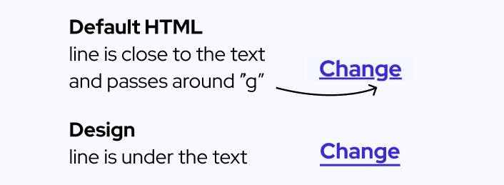
Setting the underline below text
The design file's link has the underline below the text! The default anchor tag did this. Notice that the line is closer to the text and the g letter was avoided. I probably wouldn't have noticed this if the letter g wasn't in the text.
This was a fun discovery in the end: https://developer.mozilla.org/en-US/docs/Web/CSS/text-underline-position
text-underline-position: under;
Using the grid to align the price card
My inital attempts at flexbox didn't help me align the text elements in the price card. I tried flex-basis with flexbox but I couldn't get it right. I tried grid-template-columns with grid and it was so much easier. 1fr 2fr 1fr done.

.card {
    display: grid;
    grid-template-columns: 1fr 2fr 1fr;
    align-items: center;
    padding: 1em;
    grid-gap: 1em;
Setting the Background Image
After I finished everything, I noticed that there were background image files in the folder. Vscode autocomplete helped me with this, I don't like googling because it is distracting and takes a few decisions like deciding what keywords to type, which links to click, going through different explanations, and trying to understand information. Sometimes googling is very quick, but if I memorize then I don't have to google. Autocomplete is a more realistic option.
background-image: url("./images/pattern-background-mobile.svg");
background-repeat: no-repeat;
Learning to see box shadows
This is new to me. My solution isn't accurate but close in some ways.
box-shadow: rgba(149, 157, 165, 0.75) 0px 8px 24px;
I got this above box-shadow code from https://getcssscan.com/css-box-shadow-examples #0
Getting comfortable with media queries
I was hesitant to go mobile-first. I'm learning that expanding from mobile to desktop is easier, particularly for this solution.
@media (min-width: 375px) {
  body {
    background-image: url("./images/pattern-background-desktop.svg");
    background-repeat: no-repeat;
    background-size: contain;
  }
  main {
    width: 28.125rem;
  }
  .content {
    padding: 0 3em 3em;
  }

  .card {
    padding: 1.5em;
  }

  .heading {
    font-size: 28px;
  }
}
Continued development
I need to track how long this took. I think this took about 2 - 3 hours of focused work. I used to think that I should use grid only for large layouts, but working on the pricing section was so much easier with grid.
Useful resources
- Box Shadow #0 - This helped me get box shadows.
Solution Links
Author
Website - Joe Chelladurai
Frontend Mentor Solutions - Live Site
Frontend Mentor Code - Code
Frontend Mentor - @meshach-joe
Twitter - @joe_chelladurai
Acknowledgments
Frontend mentor community solutions were helpful.